
一、折线图
折线图可以用来表示数据随着时间变化的趋势
x = [2010, 2011, 2012, 2013, 2014, 2015, 2016, 2017, 2018, 2019]y = [5, 3, 6, 20, 17, 16, 19, 30, 32, 35]- Matplotlib
plt.plot(x, y)plt.show()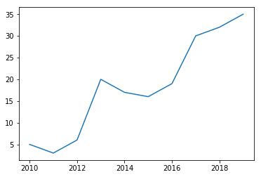
- Seaborn
df = pd.DataFrame({"x": x, "y": y})sns.lineplot(x="x", y="y", data=df)plt.show()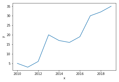
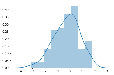
二、直方图
直方图是比较常见的视图,它是把横坐标等分成了一定数量的小区间,然后在每个小区间内用矩形条(bars)展示该区间的数值
a = np.random.randn(100)s = pd.Series(a) - Matplotlib
plt.hist(s)plt.show()
- Seaborn
sns.distplot(s, kde=False)plt.show()sns.distplot(s, kde=True)plt.show()
三、垂直条形图
条形图可以帮我们查看类别的特征。在条形图中,长条形的长度表示类别的频数,宽度表示类别。
x = ["Cat1", "Cat2", "Cat3", "Cat4", "Cat5"]y = [5, 4, 8, 12, 7]- Matplotlib
plt.bar(x, y)plt.show()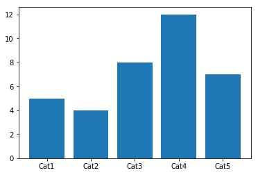
- Seaborn
plt.show()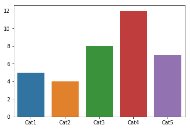
四、水平条形图
x = ["Cat1", "Cat2", "Cat3", "Cat4", "Cat5"]y = [5, 4, 8, 12, 7]plt.barh(x, y)plt.show()
五、饼图
nums = [25, 37, 33, 37, 6]labels = ["High-school","Bachelor","Master","Ph.d", "Others"]plt.pie(x = nums, labels=labels)plt.show()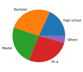
六、箱线图
箱线图由五个数值点组成:最大值 (max)、最小值 (min)、中位数 (median) 和上下四分位数 (Q3, Q1)。可以帮我们分析出数据的差异性、离散程度和异常值等。
- Matplotlib
# 生成0-1之间的10*4维度数据data=np.random.normal(size=(10,4)) lables = ["A","B","C","D"]# 用Matplotlib画箱线图plt.boxplot(data,labels=lables)plt.show()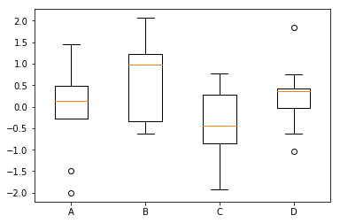
- Seaborn
# 用Seaborn画箱线图df = pd.DataFrame(data, columns=lables)sns.boxplot(data=df)plt.show()
七、热力图
力图,英文叫 heat map,是一种矩阵表示方法,其中矩阵中的元素值用颜色来代表,不同的颜色代表不同大小的值。通过颜色就能直观地知道某个位置上数值的大小。
flights = sns.load_dataset("flights")data=flights.pivot("year","month","passengers")sns.heatmap(data)plt.show()
通过 seaborn 的 heatmap 函数,我们可以观察到不同年份,不同月份的乘客数量变化情况,其中颜色越浅的代表乘客数量越多
八、散点图
散点图的英文叫做 scatter plot,它将两个变量的值显示在二维坐标中,非常适合展示两个变量之间的关系。
N = 1000x = np.random.randn(N)y = np.random.randn(N)- Matplotlib
plt.scatter(x, y,marker="x")plt.show()
- Seaborn
df = pd.DataFrame({"x": x, "y": y})sns.jointplot(x="x", y="y", data=df, kind="scatter");plt.show()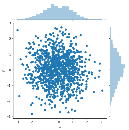
九、蜘蛛图
蜘蛛图是一种显示一对多关系的方法,使一个变量相对于另一个变量的显著性是清晰可见
labels=np.array([u"推进","KDA",u"生存",u"团战",u"发育",u"输出"])stats=[83, 61, 95, 67, 76, 88]# 画图数据准备,角度、状态值angles=np.linspace(0, 2*np.pi, len(labels), endpoint=False)stats=np.concatenate((stats,[stats[0]]))angles=np.concatenate((angles,[angles[0]]))# 用Matplotlib画蜘蛛图fig = plt.figure()ax = fig.add_subplot(111, polar=True) ax.plot(angles, stats, "o-", linewidth=2)ax.fill(angles, stats, alpha=0.25)# 设置中文字体font = FontProperties(fname=r"/System/Library/Fonts/PingFang.ttc", size=14) ax.set_thetagrids(angles * 180/np.pi, labels, FontProperties=font)plt.show()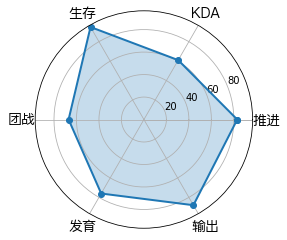
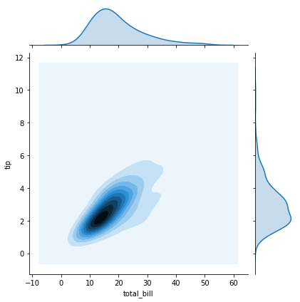
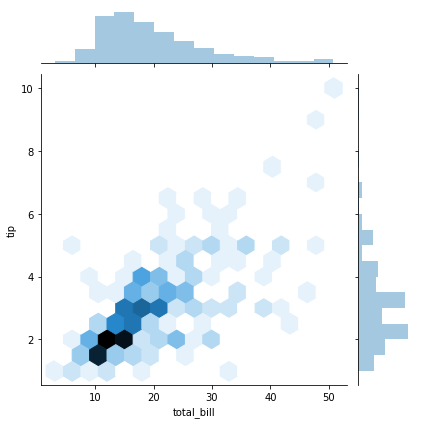
十、二元变量分布
二元变量分布可以看两个变量之间的关系
tips = sns.load_dataset("tips")tips.head(10)#散点图sns.jointplot(x="total_bill", y="tip", data=tips, kind="scatter")#核密度图sns.jointplot(x="total_bill", y="tip", data=tips, kind="kde")#Hexbin图sns.jointplot(x="total_bill", y="tip", data=tips, kind="hex")plt.show()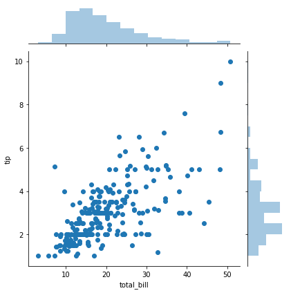
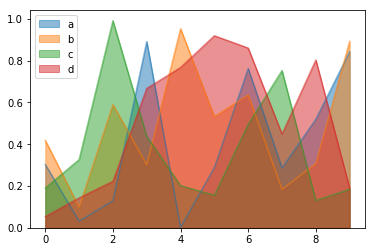
十一、面积图
面积图又称区域图,强调数量随时间而变化的程度,也可用于引起人们对总值趋势的注意。堆积面积图还可以显示部分与整体的关系。折线图和面积图都可以用来帮助我们对趋势进行分析,当数据集有合计关系或者你想要展示局部与整体关系的时候,使用面积图为更好的选择。
df = pd.DataFrame(np.random.rand(10, 4), columns=["a", "b", "c", "d"])# 堆面积图df.plot.area()# 面积图df.plot.area(stacked=False)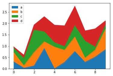
十二、六边形图
六边形图将空间中的点聚合成六边形,然后根据六边形内部的值为这些六边形上色。
df = pd.DataFrame(np.random.randn(1000, 2), columns=["a", "b"])df["b"] = df["b"] + np.arange(1000)# 关键字参数gridsize;它控制x方向上的六边形数量,默认为100,较大的gridsize意味着更多,更小的bindf.plot.hexbin(x="a", y="b", gridsize=25)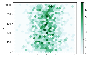
End.
作者:无涯
本文为转载分享,如果涉及作品、版权和其他问题,请联系我们第一时间删除(微信号:lovedata0520)
- 我的微信公众号
- 微信扫一扫
-

- 我的微信公众号
- 微信扫一扫
-


评论